According to the latest figures from Statista, the share of mobile traffic has gone from 0.7% in 2009 to 52.2% in 2018. Yet despite this meteoric growth, most ecommerce companies are still playing catch up with their mobile websites.
Usability research has found time and again that mobile ecommerce optimization lags heavily behind desktop, and that many online businesses still have not implemented key mobile best practices.

While this is bad news for the industry as a whole, it’s great news for businesses who can adapt quickly. Companies that get ahead of the mobile curve stand to benefit from a significant competitive advantage simply by picking the often neglected, low-hanging fruit.
In this article, we’ll take a look at five of the most important mobile best practices you can use to leapfrog your rivals:
Speed is critical for ecommerce websites, especially on mobile.
For one, slow loading times can be very harmful for conversions, and even small changes in loading speed can make a huge difference. For example, this case study from SOASTA found that reducing load times by one second resulted in a 27% increase in conversion rate.
For another, load speed can also cause you to lose organic traffic. Earlier this year, Google officially announced their “Speed Update”, now in-effect, which penalizes mobile websites who “deliver the slowest experience to users”.

If you want to increase your mobile sales, load speed is the first thing you should improve.
Start by testing your site on Google’s PageSpeed Insights tool. You should compare your own site against your main competitors, and see how you stack up. The tool will also alert you to any issues your site has, and provide suggestions for improving load speed.
One very powerful solution for speeding up your site is the Accelerated Mobile Pages (AMP) project. Conceived and supported by Google, AMP is an open-source framework that provides mobile-specific web components to significantly reduce load times. Plus, AMP articles are favored when it comes to mobile search.
AMP solves the main problem with responsive design, which is that the aesthetics of your site might scale for mobile, but its technical framework does not. As a result, you get a great-looking mobile site that loads very slowly, because its architecture has not been optimized for mobile. AMP allows you to accomplish the latter without reinventing the wheel.
While converting your website to AMP might take more work than building a responsive page, it’s an effort that will pay for itself many times over once the heavy lifting is done.
Due to the small size of mobile screens, users often won’t be able to get a good look at your product photos and screenshots at the default size. When they want to take a closer look, they typically use gestures such as double tapping or “pinching” to zoom in on images. However, Baymard Institute found that 40% of mobile sites don’t allow their product images to be zoomed through these gestures.
Ideally, your site should honor both double tap and pinch gestures, and clearly indicate to users that those gestures are supported.
Musician’s Friend provides an excellent example of this below:

Source: Musician's Friend
Given the proven importance of product images in improving online conversions, implementing and advertising a robust image zoom feature can have a very powerful effect on the mobile customer experience.
Cart abandonment is already a difficult issue on desktops, but it’s an even bigger challenge on mobile. According to research by Monetate, actual sales conversion rates on mobile are just 0.8%, compared to 2.78% on desktop:

For this reason, it’s essential to design a native mobile checkout experience that is as simple and intuitive as possible. Apart from standard best practices, like minimizing the number of steps and displaying trust seals, you should also consider mobile-specific usability issues.
An important element to consider is the concept of the “thumb zone”, which is based on mobile expert Steve Hoober’s classic study of 1,333 mobile users. Hoober found that the most common way of holding a smartphone is a one-handed grip, with your right thumb on the screen, anchored in the lower-right-hand corner.
This results in a natural range of motion, shown in the following heatmaps:
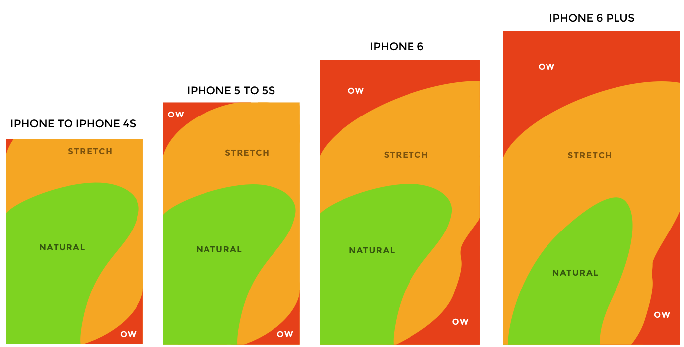
Source: Scott Hurff
Since the checkout pages demand a large number of successive actions from users, you should ensure that your customers never have to stretch beyond the comfortable range of their thumb zone at any point.
Another important mobile optimization aspect is the use of digital wallets like Apple Pay, Amazon Pay and Visa Checkout. Many mobile users depend on these wallets for more convenient checkouts, without having to fill in their credit card information on each new site. Including them in your checkout process will increase efficiency and reduce abandoned carts.
Mobile touch keyboards are much smaller, and laid out differently from physical desktop keyboards, which makes it a lot harder to input certain types of data. The most obvious example is numerical data, where the default touch keyboard lacks a numpad.
Usability testing by the Baymard Institute found that typos were much more likely on mobile sites that used the default touch keyboard for numeric inputs. In contrast, sites that offered the numpad-style layout typically used for phone calls provided a much more user-friendly experience, and resulted in fewer input errors. This was due mainly to the much larger hit area of the numeric keys – 521% larger on the iPhone 6S, for example. Despite this clear advantage, Baymard found that 54% of mobile sites fail to utilize numpad keyboards for phone, ZIP code or credit card form fields.
Here’s a great comparison between Grainger Industrial Supply’s default keyboard and Baymard’s numerical keyboard:

Source: Grainger Industrial Supply and Baymard Institute
Another way to optimize your touch keyboards is to disable auto-correct during checkout. Auto-correct can be useful for common English words, but works poorly for inputs like street names and email addresses. Baymard found that auto-correct in these fields was not only disruptive to the user experience, but also resulted in a lot of inaccurate data being submitted, without the users even realizing that an auto-correct had taken place. Yet 79% of mobile sites continue to allow auto-correct in their checkout fields.
By providing numpad keyboards and disabling auto-correct, you’ll be able to offer a much more user-friendly mobile experience than most of your competitors.
As things stand today, there are a lot of opportunities to edge the competition when it comes to mobile usability. By applying the five best practices described in this article, your company can move ahead of the pack and create a superior mobile experience. The field is wide open, so take advantage!


